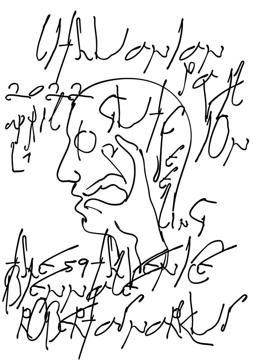
Vytautas Volbekas is a graphic designer and artist who is also working and developing visual communication and graphic design projects at the Contemporary Art Centre in Vilnius for five years already. Besides this, the artist is also involved in a wide range of projects: creating book designs for Anastasia Sosunova, Emilija Škarnulytė and several of the creative duo’s Pakui Hardware‘s publications amongst others; designing posters and contributing to the overall design of exhibitions such as Gallery Weekend for the Lithuanian National Art Museum, and working with product design and many other projects. One of his latest projects, together with Nerijus Rimkus, is the creation of the visual identity for the Lithuanian pavilion Gut Feeling at the 59th Venice Art Biennale. In this interview, we didn’t talk so much about individual projects, instead discussing Vytautas’ approach to design, its pragmatism, the conceptual levels of design, as well as his creative process and sources of inspiration.
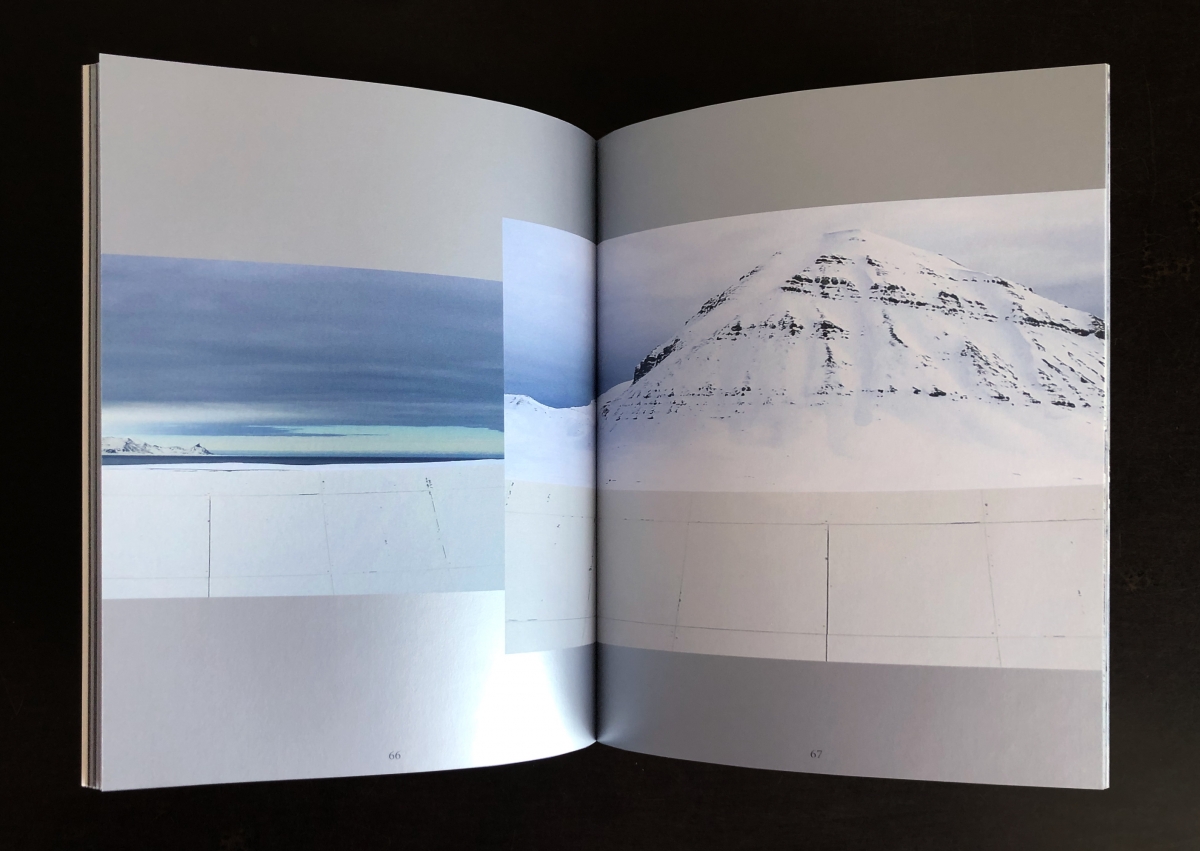
Emilija Škarnulytė. Sirenomelia. Book. 2021
Agnė Sadauskaitė: Vytautas, you studied at the Gerrit Rietveld Academy in the Netherlands. Tell us about your years in Amsterdam. How did you choose Graphic Design studies?
Vytautas Volbekas: First, I studied architecture in Lithuania. During my studies, I worked as a graphic designer in an advertising agency and eventually, questions about advertising and its limitations began to arise; perhaps it was also youthful enthusiasm. While still studying architecture, I didn’t find what I wanted and didn’t have much motivation to continue. Then I decided that I would like to delve into the field of design. I chose the Rietveld Academy because I liked most of the teachers there. Rietveld, at least at the time and probably now, wasn’t focused on commercial design, which is what I was looking for.
I’m glad I studied there. It’s been more than eight years since I graduated and it would seem that a certain distance should have appeared but even after all this time, I can see that it strongly shaped my perception of visual language, design, art and, at the same time, my respect for it. During my studies at Rietveld and afterwards, my understanding of what design is changed compared to the time when I was studying and working in Lithuania. Until now, I maintain a close relationship with the academy’s teachers and my coursemates, with some of whom I work, have joint projects or simply consult.
What left the greatest impression from the academy was the motivation and immediacy between students and teachers. Project ideas were discussed and defended every time. Of course, on one hand, such a direct relationship allows you to relax but on the other hand, it’s very binding. You feel a lot of responsibility towards yourself and the teachers but at the same time, the environment is very empowering and an atmosphere forms when you sincerely believe, want and do.
AS: People often seem to find themselves at a crossroads after studying in a foreign country as they can either stay abroad or return. How was it in your case?
VV: It was very similar. I didn’t have a lot of financial resources; I tried to work and study at the same time but the studies were quite intense and I fully devoted myself to them. So it wasn’t easy to study and live. After graduating from the academy, I lived in Amsterdam for a year but I wanted to take a break from the routine and decided to return to Lithuania for a few months while considering possibilities for further studies. However, it so happened that I returned to Lithuania and stayed. Of course, I’m not saying I’ll never leave. There is a possibility to go back but I’m not seriously thinking about it now.
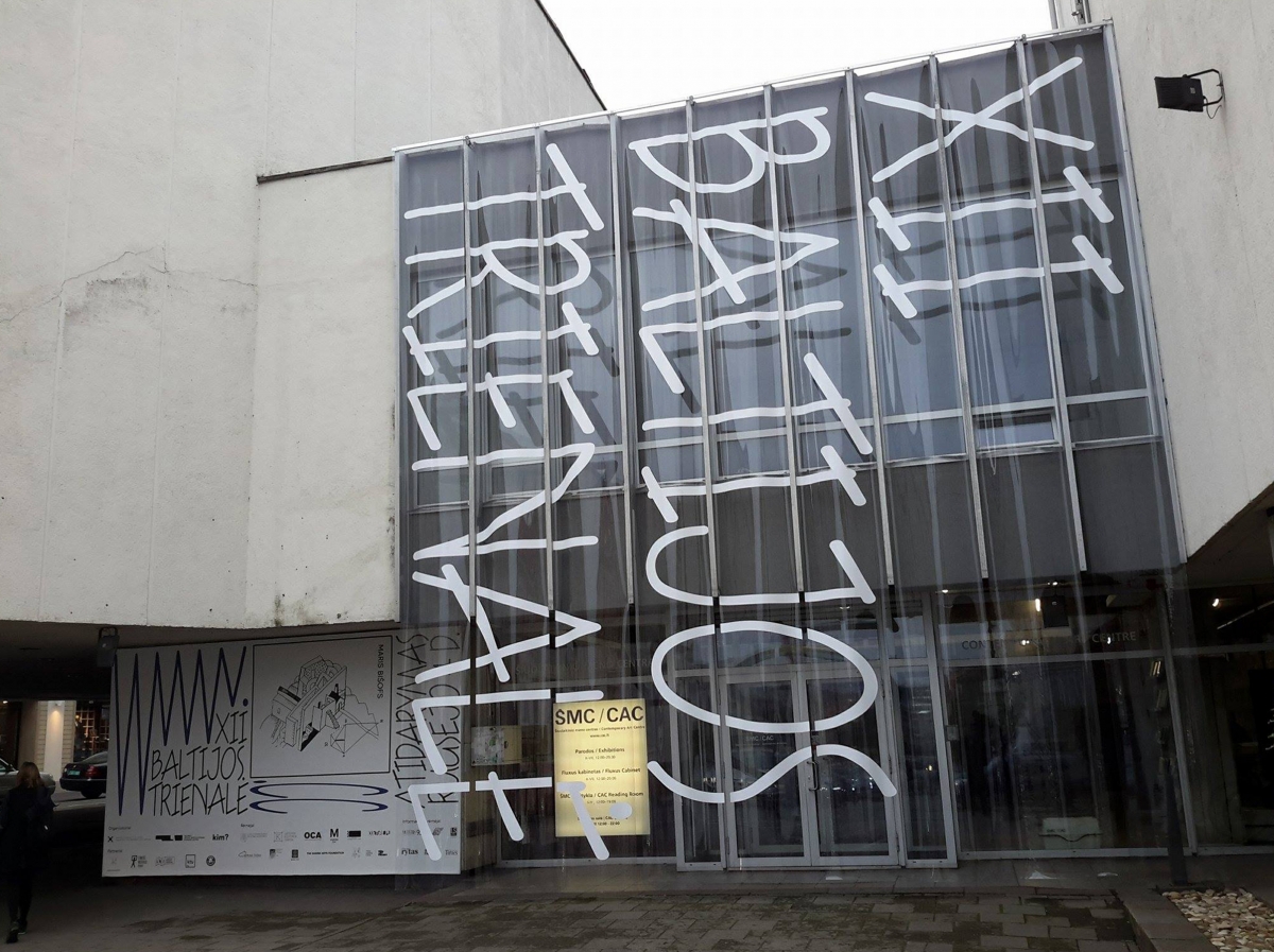
XII Baltic Triennial. CAC. 2015
AS: Did you fulfil your desire to study but this time in Lithuania?
VV: I didn’t, although I thought about it. I didn’t find anything that would motivate me. In fact, I’m constantly learning while working and communicating with clients, artists and curators because as a graphic designer, my environment is constantly changing. I try to take in as much as possible. Additionally, I participated in workshops and lectured at Vilnius College of Design so I didn’t leave the academic world. While teaching, I had to prepare a lot for lectures. It filled the time while I was considering continuing my studies. During lectures, I tried to communicate directly with students, talk, ask and give advice as I was accustomed to doing at the Gerrit Rietveld Academy.
AS: Tell us more about your lecturing experience.
VV: I taught several subjects at Vilnius College of Design, from web page creation to publication design. I tried to show the students various design options. In Lithuania, the understanding of design, especially among young people, is quite pragmatic and limited: advertising and visuals on social media. It’s the obvious money-making stuff that seems so cool when you’re young. Therefore, design studies were oriented towards the profession but not towards the meaning of design itself. We talked about what design is, what each of them likes and what each of them wants to say in a visual language. I tried to explain that there are many directions. It seems to me that among all subjects at the college, it was a slightly different approach to applied design. I myself have had a lot of experience working in advertising and applied design and I think it’s a great craft. However, there is too little talk in academia or elsewhere about the other side of design, its history, significance and necessity.
AS: Do you mean that you often encounter a limited understanding of design and a lack of the field’s wider context?
VV: Basically, yes. Students or young people think about design quite pragmatically, perhaps partly due to the fact that in Lithuania, compared to, say, the Netherlands, the United Kingdom or France, we don’t have a rich history of design. You may have an urge to create posters or prints but some things are not financially attractive and most people quickly gravitate towards advertising. Most things are done for the customer—as written in briefs, according to clearly formed tasks and strategy. The essence of design and its meaning is often not thought about. Therefore, it’s very useful to talk about it with students and see how their eyes open realising that it also is and can be a complex craft.
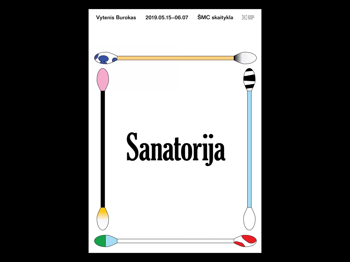
Vytenis Burokas. Sanatorium. Exhibition poster. 2019
AS: You work as a graphic designer at the Contemporary Art Centre (CAC) in Vilnius, one of the largest contemporary art spaces in the Baltic states. What does your working day look like?
VV: I’m essentially the only graphic designer at CAC so everything related to graphic design and visuals is my job. I cooperate closely with curators—we discuss new projects and the best approach. The CAC also has external projects or larger events such as the Baltic Triennial that have their own graphic designers. I like it very much because then the visuals of the event take on a different character.
I don’t have a clear and disciplined regime. The centre gives quite a lot of freedom to generate ideas in terms of both time and place. I can think about a new project as I’m walking outside because I always formulate the initial idea in my head; it’s not necessary to sit in front of a computer or a piece of paper. I don’t only work at the CAC, I also engage in side projects but I don’t differentiate them—the creation principles are essentially the same.
I spend a lot of time thinking about things and as I do so, I try to weave them together, break them apart, come up with a symbol, an idea and find a starting point. Of course, this happens after delving deeper into the topic or project, after talking with the curator or the artist. Sometimes, I get exact requirements; in this case, I still think about how to communicate it, how to use, say, a photograph or a font. Other times, I like that there is only a photo and nothing else. With the initial, clear motives in mind, I get to work. It could take me five minutes and become one of my most successful pieces but before I get to those five minutes… sometimes I come up with ideas while walking in a supermarket or I see inspiration on the street. Let’s take today—I saw a pink car and really liked it. I think if I had to do a new design right now, I’d probably do something pink. Maybe it’s infantile and primitive but if it inspires and gives you the energy and ability to process external information through yourself and transfer it, then you can also broadcast it in other ways and convince clients of your idea.
I have now been working at the CAC for five years. I really like that the CAC has and has had a fairly well-recognised identity, which isn’t created through regulations or documents but rather by a graphic designer and/or art director working for a long time and shaping the visual language. The further I go, the more conscious I am of the things being done and created in this space. Although the visuals of the exhibitions are different, I try to connect them with the common visual language of the centre so that it’s partially controlled, recognisable and coherent but not uniform.
AS: Your design works are of a very wide spectrum—you create fonts, posters, books, exhibition visuals and websites. How do you choose the commissions and projects you contribute to and want to work on?
VV: It probably won’t be a surprise but I try to work with projects where I feel good, where clients trust and believe in me (regardless of who it is—advertising clients, institutions or artists) and I don’t need to motivate or convince them with every decision I make. Of course, it doesn’t always work out because I work with both foreign and Lithuanian markets and the latter isn’t so big that I can reject all offers without any compromises. However, if there is a strong relationship and a common goal that is being pursued, which, in my opinion, is right and good, then it’s a lot of fun to work. Most of the time, people who realise this, value it financially because they feel respect towards the work and effort put in.
AS: Do you also contribute to unpaid projects?
VV: If I have the time and faith, why not? If it’s something I enjoy and want to be wholeheartedly involved in, then sure.

Shane Anderson. After the Oracle. Book cover. 2021
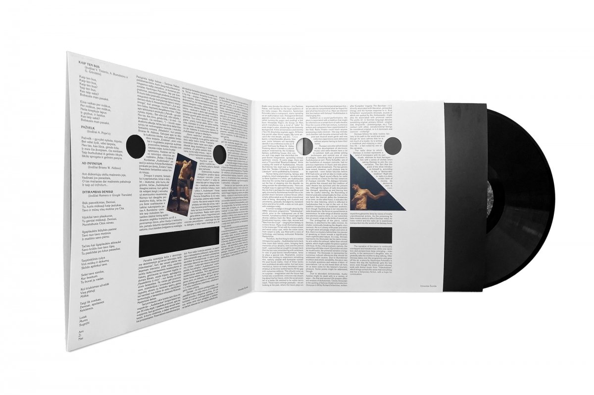
Arturas Bumšteinas. Audiokaukas. Vinyl. 2019
AS: Could you single out the area of design where you enjoy working the most?
VV: It’s difficult to answer. Perhaps I lean more towards what I can touch, more towards print than digital, although each field has its pros and cons. The projects that I identify with the most or that leave the biggest impression are those that I work with the longest and get along with. These are larger projects, books or photo albums. Then, I have a lot of material and spend a lot of time with it, comparing, looking, making decisions, memorising, say, those 800 photographs. I become one with the material for several months or longer.
The poster is also a very interesting medium for me but there is less and less space left for it in Lithuania. We only have several stops left for posters on the streets so you have to hang them illegally or at the university, gallery and so on. I’m a little sad about this because the poster used to be a widespread medium and now sometimes, even when working on an exhibition, posters are no longer needed; the poster part of the project ends with a short, digital message. It’s also discouraging because there are limited opportunities for printing. Although different paper, colours and printing technologies can be used for the poster, we cannot fully convey materials digitally.
AS: How interesting. In the past, when I was still living in Vilnius, I often noticed places dedicated to hanging posters, usually the walls of abandoned houses. Now, such places have been eliminated.
VV: Even if there were several places, it would all depend on finances. If you plan on making a poster that requires some special technology, which normally happens, for example, offset printing or using pantones, then you have to make at least around 300 pieces. After printing so much, you have nowhere to put them. People forget the craft part of design, it disappears little by little. In the field of books, it’s a bit different, maybe that’s why it’s also very fun to work with a book because it’s another dimension where the material is important. In a poster, advertisement or elsewhere, it’s usually completely eliminated and that narrows the design field.
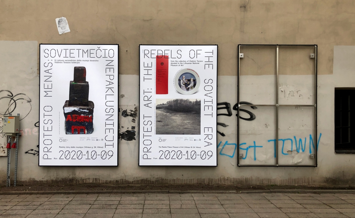
Posters for the exhibition parodai. Protest Art: The Rebels of the Soviet Era. Radvila Palace Museum of Art. 2020
AS: You have created posters for exhibitions. How do you manage to transfer the ideas of the exhibition onto one sheet of paper? What does your creative process usually look like?
VV: It so happens that most of the time the idea is reflected on more than one sheet of paper. I like to think about the whole essence of a project/exhibition and in bigger projects, it doesn’t end with just one piece. The poster is perhaps more often the initial proposal because it’s the most clearly perceived medium. Sometimes, the funniest thing is that the poster is almost never used or becomes one of the least visible parts. It would be foolish to think that there is no social media or the internet—the spaces where most information reaches us.
When it comes to exhibitions, there is a poster that usually adapts and transforms into billboards posts on social media and web pages, it’s used on profiles and from the source material, additional print media emerges. Thinking about how to convey the exhibition and its idea, I don’t necessarily rely on visuals; it can be one of the things or ideas that complement the other parts of the project. For example, an Instagram post can complement a poster or website; one medium can provide clear information and while another doesn’t provide information, it can surprise you with its visuals.
Sometimes I hear that certain posters are incomprehensible but they were discussed at some point. Maybe that was the goal, to get someone interested or angry. When you are a little interested, let’s say intrigued by the visuals of the poster, you can look into the other parts of the project—page, account or website—where you will find more information. So I like to play between media. With experience comes an understanding of how to vary among different mediums and that opens up more possibilities, even on how to defend your ideas.
AS: Could you single out which project was the most interesting or challenging to work with?
VV: I don’t like comparing my work and assigning grades. I remember the projects that I had the best time with, when I got the chance to deliver things as I hoped, when the projects succeeded and when I felt trusted. Of course, I remember the ones I did recently best. The Lithuanian pavilion at the Venice Art Biennale was complex and currently seems to be one of the most memorable works to which I had the opportunity to contribute. I did the graphic design part together with Nerijus Rimkus, a very good friend and great designer with whom I studied; this was our first time working together. The work with him and Robert Narkus, their and the curator’s trust, as well as the complexity of the project, left a great impression on me.
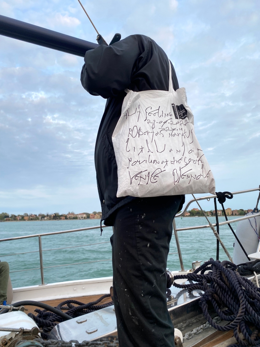
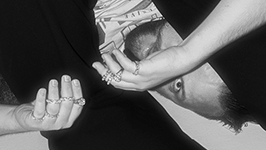
Robertas Narkus. Gut Feeling. Lithuanian Pavilion at the 59th Venice Biennale. Tote bag created with Nerijus Rimkus. 2022
AS: How long did you prepare for the Biennale?
VV: Everything happened in stages. In the beginning, we met with Nerijus and Robertas, a year and a half before the start of the Biennale. We prepared the project together. It was fun to work with Robertas because he is quite open and I felt a part of the project as a creator; Nerijus and I didn’t only work exclusively with design, our opinion mattered as well. Of course, he was the creator of the pavilion, generating and implementing its idea, but we sat together and thought about how we could develop the design and what it could be. Some of our design ideas were taken into the piece, some things from the piece were taken in by us and it came out as an interconnected thing and that’s what our aim was. After the project was selected to represent Lithuania at the Venice Art Biennale, Nerijus and I spent half a year creating an identity, from the thinking phase to making sketches, holding discussions and releasing the final results. Sometimes, even now, these processes are still taking place and there is a plan to publish a book.
AS: Would you repeat this experience?
VV: Of course. I think it’s a high achievement for a designer to create and contribute to the Venice Biennale. When you’re working, it becomes a common experience but after a while, you can appreciate it from a different perspective. In this case, I would also repeat it because I was closely involved in the process itself—such opportunities rarely occur.
AS: In 2021, you resided at the Nida Art Colony, where you created part of the identity for the Lithuanian pavilion.
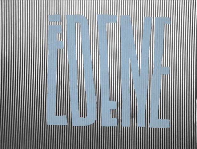
VV: Nerijus and I generated ideas for a long time and the time came when we had to start making. As a starting point for the Biennale, we created a font called ‘Gut feeling’. While creating it, we thought about something that could be simultaneously readable and not, letters and drawings at the same time. We analysed different drawings from various cultures, starting with graffiti, which is an abstract readable thing, to Roman cursive fonts. The latter intrigued us because you can read them but not completely and it became a kind of drawing. We looked at Vietnamese and Thai fonts that resembled Latin letters and thought, why not try to fundamentally redesign letters? Where is the thin border between drawings and letters? At Nida Art Colony, this is exactly what I was doing because creating the font took a lot of energy and time. The font became one of the parts of the Lithuanian pavilion’s identity, which we used quite a lot. Later, several other parts of the design were closely related.
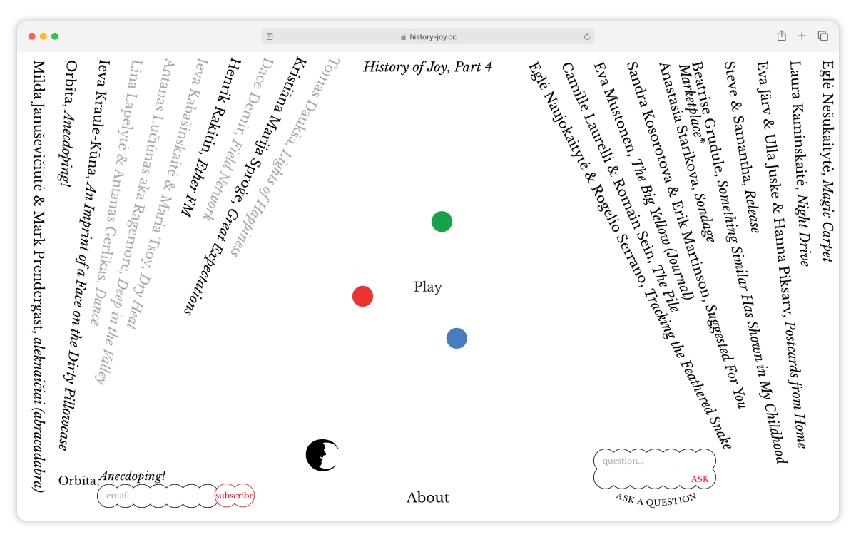
www.history-joy.cc website. 2021
AS: People are often divided into several sides, some supporting biennials as a way of representing countries and their art, others questioning such approaches. What is your opinion about art biennales?
VV: I think it’s interesting to participate in biennials, presenting the country and the artist. Biennale selection should be a strategy and done professionally. Looking at Lithuania’s achievements and comparing them with other countries, we execute this part perfectly. I’m very happy, especially for the artists who participate and have the opportunity to create a project with such funding, which artists in Lithuania rarely have. The artist gets a lot more tools and a lot more pressure, of course.
AS: What do you think shaped your style the most?
VV: I think it won’t surprise anyone—observing the environment, being honest with yourself and not trying to please anyone are essential for me. I get a lot of ideas from fashion design, although it’s not like I follow a lot of design blogs or other designers‘ work. Also, food, sports, pop culture, nature or fishing bring good ideas sometimes. Heraldry, flags, road signs, store signs and graffiti are also inspiring as a way to convey information and influence the surroundings. I connect one area with another. Inspiration mainly comes from hobbies and after filtering through them, I can get unexpected or more interesting ideas and then release them into the design field. I also get inspired by dreams or what I see while walking down the street. I try to reduce and simplify everything to the absolute minimum and then expand it all to understand what and why I’m doing something. Maybe some people find my designs very simple but I think that a design should be impactful and understandable.
Robertas Narkus. Gut Feeling. Lithuanian Pavilion at the 59th Venice Biennale. Poster created with Nerijus Rimkus. 2022
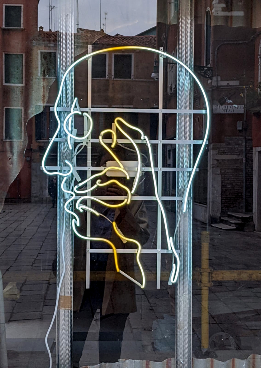
Robertas Narkus. Gut Feeling. Lithuanian Pavilion at the 59th Venice Biennale. Neon created with Nerijus Rimkus. 2022
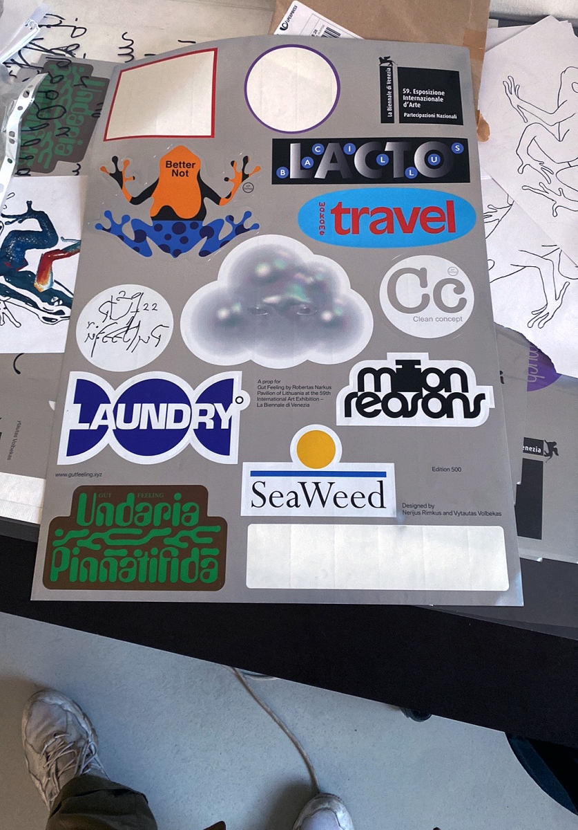
Robertas Narkus. Gut Feeling. Lithuanian Pavilion at the 59th Venice Biennale. Stickers poster created with Nerijus Rimkus. 2022
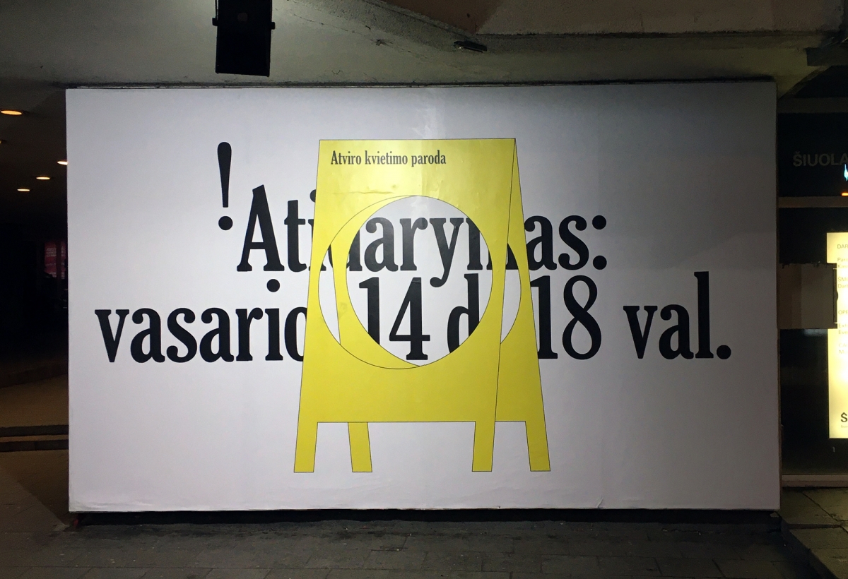
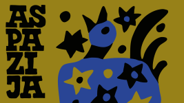
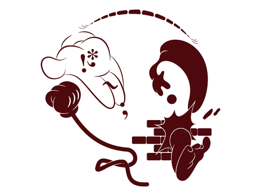
Head With Many Thoughts, CAC, 2020. Poster
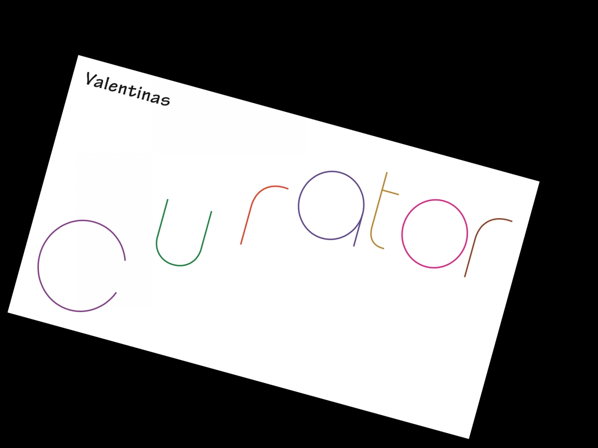
Business card for curator and writer Valentinas Klimašauskas. 2019
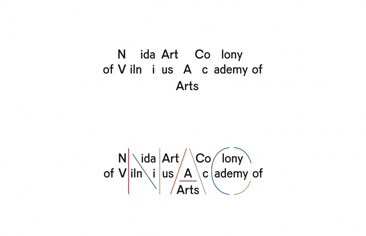
Logo for Nida Art Colony. 2020